TLDR
Build slides at 1080×1350 px (portrait, best for mobile reach). Export them as a single multi-page PDF under 100 MB. On LinkedIn, click Start a post → the document icon → upload. Add a title, post.
Why carousels still get more reach
Every swipe is a fresh dwell-time signal. A static post gets one shot at attention; a carousel gets eight. The algorithm reads that as "this content keeps people on platform," and rewards it with reach.
What LinkedIn accepts
Portrait (4:5) eats the most vertical space on mobile, where most LinkedIn traffic happens. Square loses ~30% of the screen on phones. Landscape is technically supported but rarely worth it.
The manual method
Here's what it takes without a dedicated tool. Plan for an hour the first time.
1. Design 8–10 slides at 1080×1350 px
Open Figma, Canva, Slides — whichever — and create an artboard at 1080×1350. Eight to ten slides is the engagement sweet spot. Slide one is the hook (a question, a number, a contrarian claim). The middle slides carry the argument. The last slide drives the action.
The biggest mistake non-designers make here is drift: slide one is crisp; by slide seven the headline font has wandered, the brand colour shifted, the spacing feels different. Pick one typeface (two weights), one accent colour, and one vertical rhythm before you start. Resist the urge to make any slide "special."
2. Export as a single PDF
If your tool can export the deck directly to PDF (Figma, Slides, Keynote, Canva all do), use that. Otherwise export each slide as PNG and stitch them with Mac Preview, Acrobat, or ILovePDF.
Critical: open the resulting PDF and verify the page size is 1080×1350 px. Some tools silently rasterise to A4 or letter, which means LinkedIn gets a 612×792 PDF and your slides display blurry.
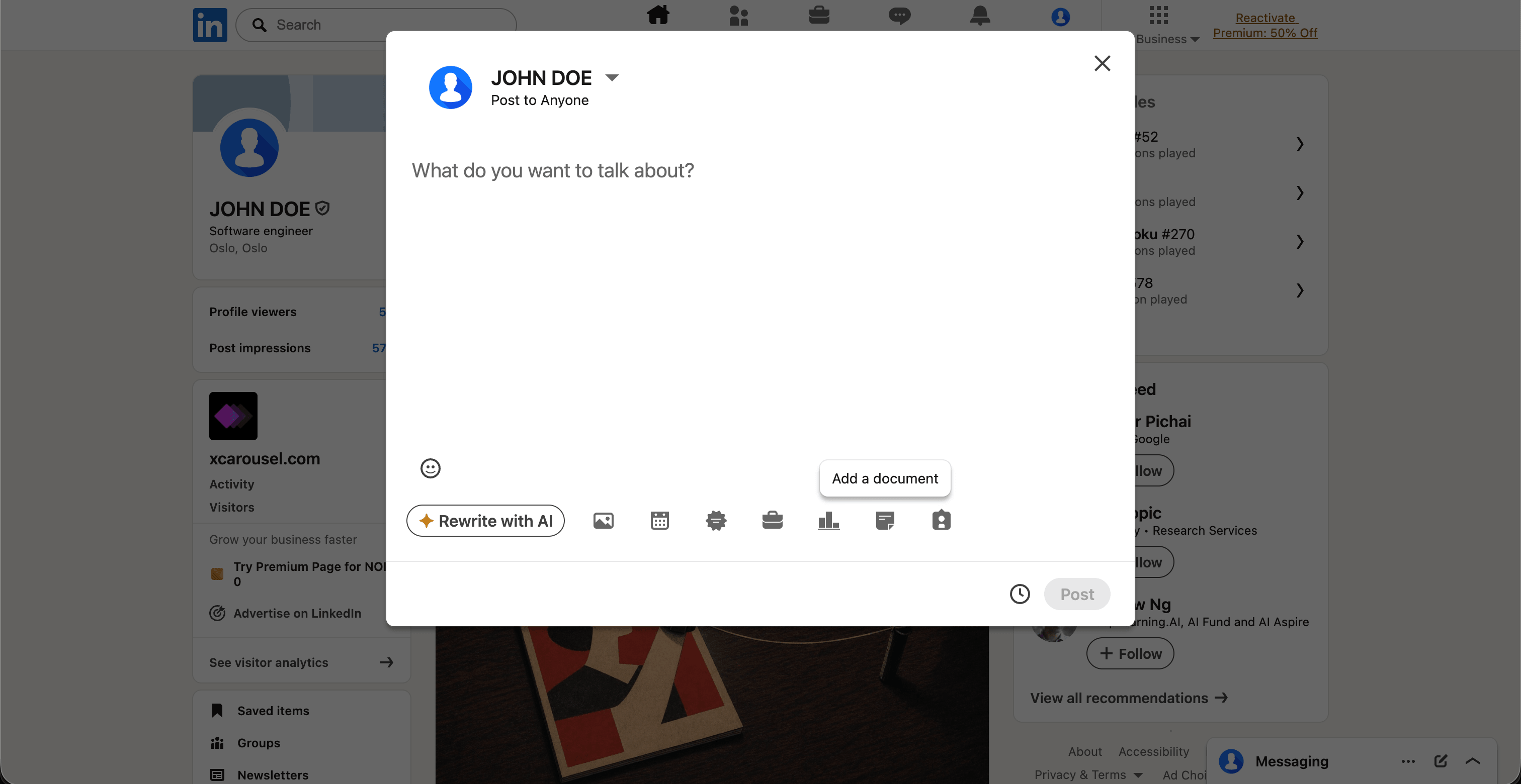
3. Upload via "Add a document"
On LinkedIn desktop, click Start a post. In the composer, click the document icon (sheet of paper). LinkedIn calls it "Add a document," not "Add a carousel" — the entire reason this feature is so under-used.
4. Write the title and post copy
The document title becomes the cover line below the carousel in feed. Make it the strongest version of your hook — empty title fields are the single biggest reason carousels underperform.
Three to five lines of post copy is plenty; the carousel does the heavy lifting. End with a question to drive comments.
5. Post — and reply for the first hour
Hit Post. Then reply to every comment for the next sixty minutes. Early conversation depth is the strongest reach signal LinkedIn has.
You cannot edit a carousel after posting. LinkedIn doesn't let you swap the PDF. To fix a typo, you have to delete and re-upload — losing every impression, comment, and reaction the post has already earned. Proofread first.
Common mistakes
- Wrong aspect ratio. A 1:1 square in a 4:5 mobile feed leaves ~30% of the screen empty and tanks dwell time.
- Compressed exports. LinkedIn re-compresses everything. Start with high-quality PNG, not lossy JPG.
- Twelve+ slides. Completion rate falls off a cliff after slide eight. The algorithm reads incomplete swipes as disengagement.
- No hook on slide one. "5 lessons from..." isn't a hook. "I lost $200K learning this" is.
- Empty title field. It's the cover line. Leaving it blank is the same as posting with no caption.
Skip the manual work
Everything above is the manual path. It works. It also takes about an hour the first time, and twenty minutes every time after — design at the right dimensions, export, verify the PDF, upload, write the title, post.
Or you skip all of it.
xcarousel does the whole flow in about a minute: paste a URL, a topic or a PDF; the AI writes the slides, applies a designed template, exports a LinkedIn-ready document at 1080×1350, and posts it directly to LinkedIn from inside the editor. If you make carousels regularly, that's an hour a day saved every day, for the cost of one coffee.